I had to put the link due to the inability to upload the video straight to the blog.
https://www.youtube.com/watch?v=40ivfiqpe70
Tuesday, 15 March 2016
editing comparison
evaluation Q7
At the beginning the planing of films (preliminary) was slower and less organised, we all had lots of in put towards it, yet we would just all say them at once and not have any structure to it, this led to arguing and disagreement.
this all became easier and more organised towards are film opening, i believe this was because i was working with a close friend and in a smaller grope, Also because we actually planed everything weeks before filming instead f just going streaght into it.
Are equipment that we used was all the same but we had had more training and experience in using it by are film opening.
Are editing was better also due to more practice and experience of using the software.
evaluation- Q5
- we used close ups to create mystery when filing the older man
- we used fast past editing to create tension and excitement
- we used target audience research to find out what they liked and didn't like
Are target audience research came back positive but still with some improvements that could have been made.
1. did you like it?
all the patisapants said yes
2. which title did you like best
carbon pictures? 2 voted for this
cp productions? 2 voted for this
atmospher entertainment? 7 voted for this
3. out of ten what would you raite are film, 1 being bad 10 being good?
1- 0 voted
2- 0 voted
3- 0 voted
4- 0 voted
5- 1 voted
6- 5 voted
7- 3 voted
8- 2 voted
9- 0 voted
10- 0 voted
4. what would you change?
we had a mixed result of answers here:
we got asked to change the car because it dosent co-respond with the time it is set in.
we were told there where to many shots of clothing.
to make the shots smother and more clean.
have more shots of the car.
have more background sound.
evaluation-Q 4
What rating is are film?
I believe that are film would be rated a 15, as a 15 is described as by the bbfc "No-one under 15 is allowed to see a 15 film at the cinema or buy/rent a 15 rated video. 15 rated works are not suitable for children under 15 years of age."
A 15 can include any of these:
- strong violence
- frequent strong language (e.g. 'f***').
- portrayals of sexual activity
- strong verbal references to sex
- sexual nudity
- brief scenes of sexual violence or verbal references to sexual violence
- discriminatory language or behaviour
- drug taking
I believe that are film would come under this rating as later on in the film we would try to include an actual crash scene, this would include a shot of the driver injured with some blood and gore. We would also have strong language and there might be some form of drug taking involved, these are all seriotypical iconograpys of a race film/ any sport film.
evaluation- Q3
We bleve are film could be spreed on a globule level, with a tent pole audience.
In order for us to be successful in this we must pick the right distribution company, we descused and came to a conclusion that we should pick lions gate or fox search lights as they have both had experience distributing on a globule level and both had success in this type of distribution.

Lions gate have distributed a range of successful films such as:
the hunger games trilogy
Rambo
all the saw films
american psycho

And fox search lights have distributed films such as:
Black swan
Slumdog millionaire
The good girl
In order for us to be successful in this we must pick the right distribution company, we descused and came to a conclusion that we should pick lions gate or fox search lights as they have both had experience distributing on a globule level and both had success in this type of distribution.
Lions gate have distributed a range of successful films such as:
the hunger games trilogy
Rambo
all the saw films
american psycho
And fox search lights have distributed films such as:
Black swan
Slumdog millionaire
The good girl
evaluation- Q2
Are film has two main social gropes, the young driver and the older injured man. The younger and the older men are corcasion male that are represented with the stereotypes of there gender, race and age.
Young men (around the late teens and early 20's) are usually stereotyped as being independent, maybe a bit stupid (not thinking about things before they do) and risk taking, this is shown through his:
Costume- he is wearing his race jumpsuit and his whole race gear, this shows that he is a risk taker and also very independent for his age as he is still young yet he is already racing professionally this shows the independence, yet the actual fact that he is racing shows the risky side of his youthful age.
Props- his props are basically only his race car, this shows Independence as he must maintain the car at a young age meaning he must have another job, the car in its self being a fast car and the race is already dangerous this shows his risk taking but also that hes still maybe a bit childish and a bit stupid as he is racing a fast car against other fast cars on a track at a young age before he has had a chance to live his life.
Older men (middle aged) are represented as being independent, more able and more sensible, this is shown through his:
Costume- he is wearing a very stereotypical outfit of an older male, which includes a formal shirt, trilby hat, trench coat and boots this enthisises his age and also the stereotypes that his age comes with.
props- his prop actual subverts the stereotypes of his age and ability, he has a walking stick, this is usually shown with disabled and/or elderly members of the public. This prop defiantly subverts the traits his age and ability should show, this is what we where trying to portray- a middle aged man with a disability due to racing.
evaluation- Q1
Titles: we called are titles carbon pictures, this is supposed to connote the aspect to racing due to carbon being an alternative fuel source and i bi product of petrol. We also had atmosphere entertainment this is to resemble the actual atmosphere at a typical race tournament.
We used the default designs on are editing software, we had a look though all the options and chose the best ones that would match are title names and also help enhance the car action genre.
We both looked at different films to help give us ideas of are titles and rush was probably the largest influence we had.
Credits: Are credits are mainly based on the ideas from rush but we also got help from watching other AS level film openings, the names we used are mostly people that actually helped with are film production and a few are people that just asked to be on the credits.
Characters: We had one protagonist, but he was shown throw 2 different times of his life, when he was young and a new racer, this connotes the stereotype of a racer being young, fit and healthy. And then we are shown the same man through his mid age time were he is portrayed as an older man as he uses a walking stick, this could also show injury which is what we were going for.
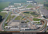 Setting/Location: We were restricted with are location mainly because both me and Alex live to far away from each other so we reduced are filming to the Silverstone track and around are college
These locations were actually perfect, as the track is probably the largest and best location that perfectly represents the racing genre and is within traveling location for both of us.
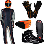 Costumes: we had two costumes we had the race gear for the young driver, which consisted of a racers jumpsuit, race boots, race gloves and a helmet. this costume shouts racer and defiantly connotes the conventions of a racing film.
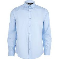
we then had the midle aged man, who was wearing a trilby hat, fingerless gloves, a black trench coat, a blue shirt, purple chenos, black chelsy boots and a skalf. this show an older look and shows he has grown up more.
Camera work: the camera is used in many different ways and when we were showing the older man we used close ups to show more specific detail, and we don't show his face till the end to give the audience an aspect of mystery.
editing: we used a lot of editing and we mainly used simple cuts or fades to show a change of time, location and atmosphere. we used a faster pase of editing when are protagonist was a young driver to show tension and to show he was a younger more able man and cold move at a faster pase, and we used slower editing when he was a middle aged injured man as he is less able and also older
We used the default designs on are editing software, we had a look though all the options and chose the best ones that would match are title names and also help enhance the car action genre.
We both looked at different films to help give us ideas of are titles and rush was probably the largest influence we had.
Credits: Are credits are mainly based on the ideas from rush but we also got help from watching other AS level film openings, the names we used are mostly people that actually helped with are film production and a few are people that just asked to be on the credits.
Characters: We had one protagonist, but he was shown throw 2 different times of his life, when he was young and a new racer, this connotes the stereotype of a racer being young, fit and healthy. And then we are shown the same man through his mid age time were he is portrayed as an older man as he uses a walking stick, this could also show injury which is what we were going for.
 Setting/Location: We were restricted with are location mainly because both me and Alex live to far away from each other so we reduced are filming to the Silverstone track and around are college
These locations were actually perfect, as the track is probably the largest and best location that perfectly represents the racing genre and is within traveling location for both of us.
 Costumes: we had two costumes we had the race gear for the young driver, which consisted of a racers jumpsuit, race boots, race gloves and a helmet. this costume shouts racer and defiantly connotes the conventions of a racing film.
we then had the midle aged man, who was wearing a trilby hat, fingerless gloves, a black trench coat, a blue shirt, purple chenos, black chelsy boots and a skalf. this show an older look and shows he has grown up more.

Camera work: the camera is used in many different ways and when we were showing the older man we used close ups to show more specific detail, and we don't show his face till the end to give the audience an aspect of mystery.
editing: we used a lot of editing and we mainly used simple cuts or fades to show a change of time, location and atmosphere. we used a faster pase of editing when are protagonist was a young driver to show tension and to show he was a younger more able man and cold move at a faster pase, and we used slower editing when he was a middle aged injured man as he is less able and also older
Monday, 7 March 2016
editing sound
For the opening section of the film, we chose to use "Ain't No Sunshine" by Bill Withers because we wanted an old song from the 70s to show the audience that we are going to be showing an old person from that era, and that we're going to show a scene from that time as well, which is the flashback. It is also a calm song, which will convey to the audience that what they're watching at that time is calm. This will contrast to the second soundtrack we use, which will be dramatic and tense, and the audience will be able to differentiate between the two so their emotions will change.
Obviously we can't use the original version as that is copyright, so we found a cover version on YouTube which is copyright free.
For the rest of the sounds, we are looking on freesound.org to find a dramatic suspense non-diegetic underscore to go over the flashback scene, to create a negative feeling for the audience. We're also trying to find a heartbeat effect to show the audience that the character is nervous.
We both decided to record our own commentary over the flashback to show that this was a professional competition and therefore a big deal to the character, therefore creating more drama. We recorded our voices on a programme called audacity, with Alexs Blue Snowball microphone which he brought from home.
editing titles
The opening titles (first 2) show who the film is made by. Both titles look professional and connote a car film as the word 'Carbon' relates to cars. Also the font looks bold and uppercase, which shows the film is serious. The font isn't curly or lowercase, which would show the film is going to calm, maybe a romance. We changed the font of the title on the establishing shot to italics as it connotes a car film more, as italics looks like a car speeding.
editing filter development
The original clip is too dull and doesn't portray anything, so initially Alex gave it a dark orange effect. The dark shows it is a negative time, and the orange gives it a slight flashback effect. However, I thought a black & white effect would make it clearer that this was in the past and a negative time, so I edited it and Alex agreed with me, so we're going to stick with the black & white effect for the all the flashback clips.
Thursday, 3 March 2016
editing-rough draft
This is our first draft, with no sound. alex edited this by himself with the intention that Ill improve it and we'll start the second draft together. He added a dark orange effect over every clip to create a negative atmosphere, and he also added a letterbox effect (the 2 black lines on the bottom and top) to give it a cinematic, widescreen effect. He also added a shaky effect when the car started, to obviously show that the car had started. When the car sets off, he sped it up because the original clip looked too slow and unexciting.
- It is missing 2 shots as we didn't have enough time in the car, but we can easily use a different car
Subscribe to:
Comments (Atom)


